As we begin a New Year, it’s a great time to look back on some of the things our customers had to say in 2022. We believe our quality work and customer service speaks for itself, so here are some of the things our clients said about their new custom homes over the past year.
Attention to Detail and Quality Materials
“I highly recommend Precision Custom Home Builders for anyone looking to build a new custom home. As a local realtor, I’ve worked alongside Dan, Katy & their team to build multiple homes for my clients since 2017. Precision’s team has the process of building a home down to a science. Their attention to detail along with their use of quality materials makes them stand out. I can always count on Precision to deliver a quality built, beautiful home.” – Houzz review in March 2022
Five Stars
“Beautiful high quality homes!” – Facebook review in April 2022
Outstanding Quality and No Corners Cut
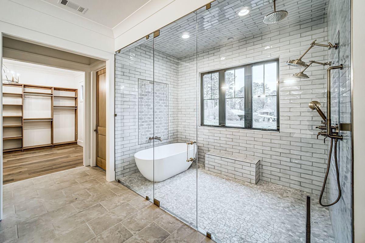
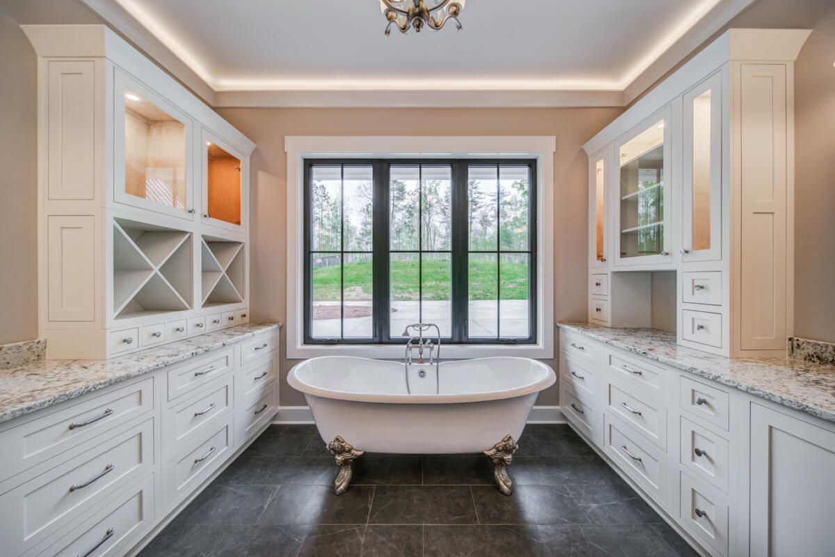
“Precision custom homes was an honest, fair and overall great business to work with. They built our Milton home with outstanding quality (extremely sturdy framing, massive beams, precision on interior work) at a very reasonable price. All of their suppliers did excellent work and we do not see that any corners have been cut. Our house was built within a reasonable timeframe with some delays due to Covid and minimal delays on the builders side.” – Google review in April 2022
Quality Product for Their Customers
“I started my residential framing business in 2002 and began working with Dan and Katy in 2006. I’ve worked with literally hundreds of customers in the last 20 years and I’d have to rate Precision in the top 5 when it comes to professionalism, attention to detail, ability to accommodate customer preferences and most importantly, their desire to produce a quality product for their customers.” – Google review in April 2022
Nothing but Positive Things to Say
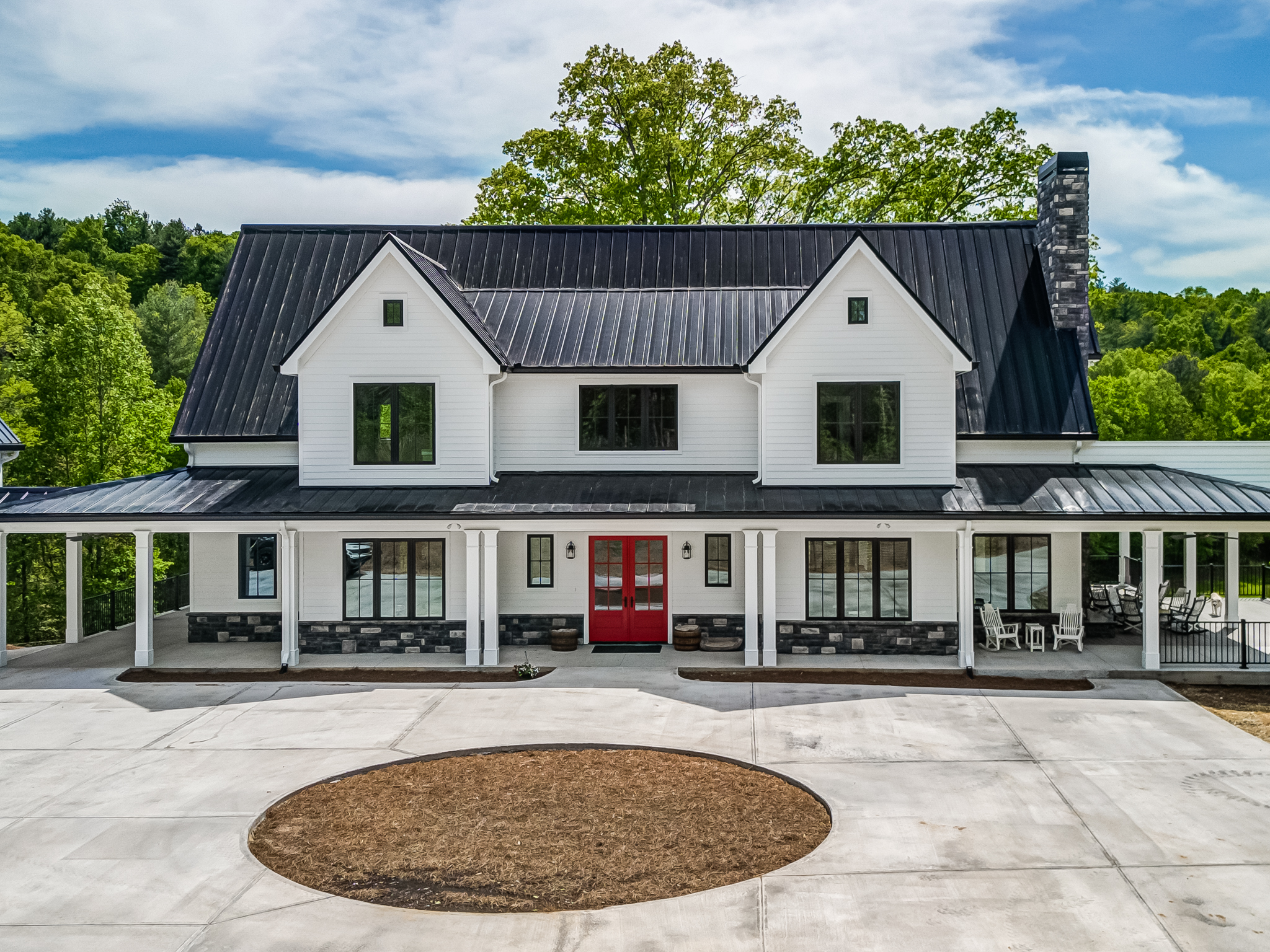
“We moved to GA from VA to build our custom retirement house in 2021. Our son, who had contracted with Precision Custom Home Builders (PCHB) to build a house in 2020, recommended we use PCHB based on his positive experience. We met with some of the PCHB team (Dan, Katy, Brittany, Jared, Brandon) to review our plans and listen to their recommendations so that we could keep within our budget.
They were most helpful, patient, accommodating, and professional, so we decided to contract with PCHB to build our new house – the Sagecrest design. It can be a bit intimidating to build a new, custom home, but PCHB “held our hands” throughout all the preliminary work of getting permits, surveys, etc., and meeting with vendors. All the vendors that PCHB recommends offer top-quality materials and workmanship, plus we have found them all very helpful in deciding which materials to use.
Our house is scheduled to be finished in about 2 months, which will be 2 months ahead of our contracted schedule. Throughout the building process, the PCHB team has been readily available to meet with and assist us with our many questions and walkthroughs. Their ability to schedule sub-contractors, who they trust, is very impressive, and there has hardly been a day go by without workers on site. We have met with many of them onsite, and we have always been impressed with their expertise. Their project managers, Jared and Brandon are onsite almost daily to verify progress and quality of work. PCHBs are very, very good at scheduling and making sure all the work is finished right. Any building project runs into some field changes and mistakes, but PCHB always corrects any shortcomings that come up on site. I can’t emphasize how very important their teamwork on getting it right is to provide us with full confidence in knowing, it will be done right.
This building time period has presented many difficulties for the PCHB team, and us, because of the current supply chain delays and backorders caused by all the Covid-related economy issues. For example, it appeared that we weren’t going to be able to get the shake siding we wanted; however, the PCHB team called over 10 of their suppliers and were able to find them. They are very persistent. Also, we had to wait over 5 months before the last of our windows were delivered for installation! However, PCHB kept the project moving throughout it all. We have nothing but positive things to say about PCHB.” -Facebook review in March 2022
Reliable and Honest
“My biggest anxiety when selecting a builder was finding a reliable and honest builder who could build a quality home. Someone you can trust. Precision builders met and exceeded all expectations. From the design process all the way through construction.
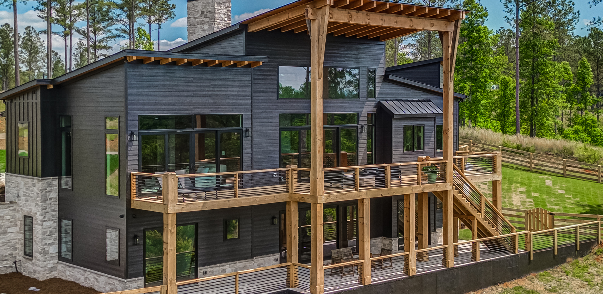
Building a home in the middle of a global pandemic and supply chain crisis had its challenges. Precision guided us every step of the way. Now that we are living in our mountain dream home we pinch ourselves every day and are thankful that we found a high quality building company composed of wonderful individuals.” -Houzz review in May 2022
Top of the Line Homes
“Dan and Katy have been great to work with over the years. Top of the line homes with perfect finishing touches.” – Google review in July 2022
We Continually Receive Compliments
“We moved from Dallas Georgia to Jasper Georgia. Out of several builders in the Pickens county area we choose Precision Custom Homes. Precision provided a list of clients that we were welcome to speak to, this along with the reviews we read helped us make our decision. We already had our property and Dan came out, walked the property and provided input on placement of the house.
The build went faster than the proposed timeline and we moved in three months ahead of schedule. We appreciated the process provided by Precision Custom Homes for us to follow. This ensured that all our features and fixtures were here when needed, not causing any delays on the build. If there was anything we wanted changed, the change process used was beneficial for all parties.
Everyone on the team was very professional, and attentive to our needs. The quality and craftsmanship of our home is exceptional and we continually receive compliments on it. We love our new home and would recommend Precision Custom Homes to anyone looking for a dependable, high quality contractor.” – Houzz review in August 2022
We are Beyond Impressed
“We’re just started our custom home building adventure with Precision and we’re beyond impressed. The team is courteous, available, knowledgeable and fun to work with. The first few weeks has been a whirlwind and I’ve had tons of questions and moments of panic – Dan, Brittany and Reed have all answered my concerns and made me feel very confident in our selection of builder! I know they will be there to personally address any issues or questions we have and I look forward to the next phase of the building process!” – Google review in August 2022
Blown Away
“Reached out while interviewing builders to design and build our custom home. Entire process was smooth and great. Britney was very helpful getting our information and coordinating schedules. Upon meeting Dan we were blown away by his presentation. The amount of information he packed into an hour-long presentation was staggering. He was thoughtful and took the time to answer our questions and walk us through the Precision process. I also found him to be transparent and honest with his estimates and setting expectations. Very impressive.” – Google review in September 2022
Working with PCHB was a Joy
“When I started looking for a builder for my house, I searched the internet for “5 Star” companies in the Northwest Ga area. It was a daunting process and finding somebody that does quality work and is reliable and dependable, can be very difficult. Throughout my search, Precision Custom Home Builders kept coming to the top of my list. I made an appointment and met with the owner (Dan Ellsworth) to walk my property. At the time, we had some ideas, but no firm plans. I liked everything about Dan from the moment I met him. His personality and demeanor were outstanding and he offered us a lot of great ideas.
My wife and I looked through hundreds of floor plans, including many that Precision Homes had in their portfolio. After considering several floor plans and pricing options, we finally sketched out a floor plan on a piece of paper and the square footage we were looking for. Dan helped us find an architect, who brought our ideas into reality. I chose Precision Custom Home Builders out of four custom home builders in the area because I believed their construction was the highest quality, by comparison.
Working with the Precision Custom Homes team was a joy! From the beginning all the way to the end of the build, we felt like we were part of a family. Precision’s quality standards, attention to detail, communications and commitment to complete satisfaction, were second to none. Everybody on the team is committed to the same high standards, which is due to the hard work of Dan and Katy Ellsworth.
There were no surprises throughout our entire build process and someone from the team was always available if we had questions. Additionally, the house was built ahead of schedule during a very difficult time in our country. I can’t say enough good things about everybody on the team. Dan, Katy, Brittany, Jared, Brandon, Larry, Mica and the many subcontractors that we met, all made our dream come true.” – Google review in October 2022
They Take Pride in Their Work
“We have been looking to build our custom dream home for years. We finally decided to take the plunge and do it! We selected five possible builders in the Jasper area. After an exhaustive process we decided on Precision Custom Homes. They were not the cheapest but who wants the low bid to build your dream home. Not us. Several things made us choose them. First, Dan was the only builder to stress he was building “our” house. [The] rest felt like we were buying a spec house that we could pick some items for. Secondly, they build true custom homes. They design from ground up. You get exactly what you want. Lastly, the quality was a key consideration. Dan gives a features list out and if you know anything about building you can see they do the little things that make a house high quality. It also does not hurt that this is a family company. From design to construction you’re always dealing with a family that takes pride in their work.” – Google review in December 2022
Thank You to All of Our Wonderful Clients!
We are so grateful to have the opportunity to work with each and every one of our customers, Thank You for choosing Precision Custom Home Builders! And another special thanks to everyone who submitted a review of Precision Homes! To read full reviews and see a gallery of our completed homes, you can visit our Houzz page, our website, the Facebook page, or see more reviews on Google!